Descruption
Kamiku's Part
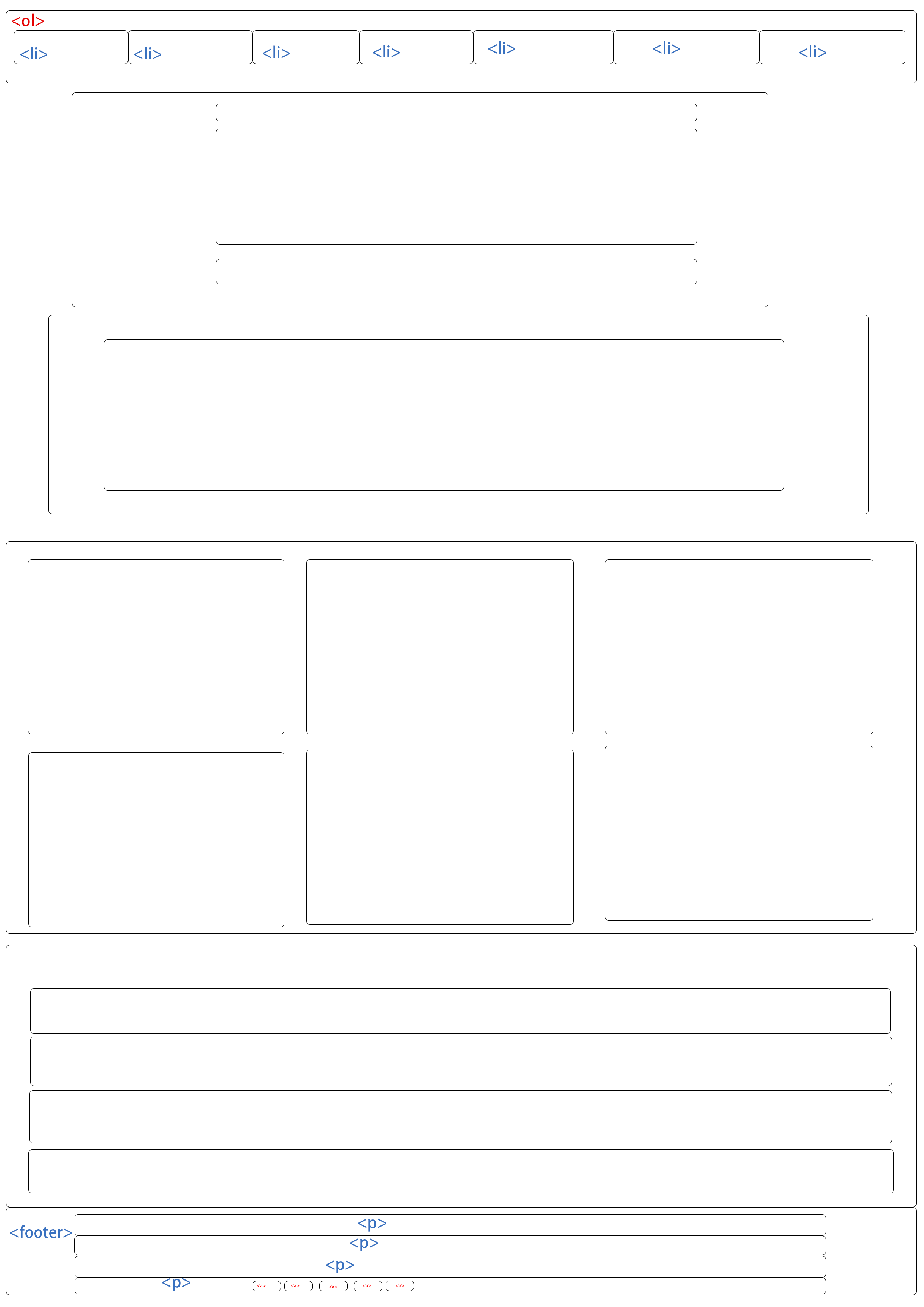
I was responsible for designing the navigation, sponsors, projects, schedule,gallery and footer sections of the entire page.After several previous assignments, I found that simple color combinations can make a page look more comfortable.So I started using black and white to color the entire page.The navigation section is often accessed, so I decided to put it at the top of the page.I decided to use the rainbow theme because there are exactly 7 lists.In the footer I used a light to dark green to represent the theme of the school including the setting of the background.
On judge, project, and schedule I used grid and flex methods to arrange messy layouts.Although I encountered a class problem and an item conflict with the same name while working on it, it took me a lot of time to solve it.Also on the mobile page I changed the flex direction to the column to match the phone's view.Among them, the title part is the part that I am most satisfied with. Before, I just put the picture on it, but I found that if I put the text on the picture, it can not only make the title match with the picture, but also save some space to beautify the layout.So I tried to do this on every page I was responsible for.The Gallery section has no images, so I used the CSS: after feature to add an image after the title = as the underlying image, and then put the following paragraph on top of the image to make the page look more balanced. Schedule is a tricky part of the project. The long table makes me feel helpless.I started off with a grid or flex, but I gave up and just kept going.But I made a little modification to the aside part.Start by placing them on the right side of the screen, and when the mouse hovers over them it slides out from the right.
Overall, there are a number of areas where the whole page can be tricky (without being able to change the HTML).The Nav part, because the HTML provides buttons about the mobile Nav, but because the script cannot be used, the Nav in the mobile page changes back to the original state instead of sticky.In the plan, I plan to use nav after clicking the button, and then click to disappear, but this part can be implemented in the final project.
-
Nav and Footer Layout -
Judges,Schedule,projects Layout -
Mobile layout
Nevin's Part
I was responsible for designing the header as well as the home and about pages.
For the header I wanted something simple and elegant so I spent time picking out the right font and fiddling with the spacing and font size. I worked on the header on and off for the whole time I was working on the project because I kept noticing things I didn;t like or that could be better. The animation on the "CS Fair" text also took a fair amount of time to get it to look how I wanted.
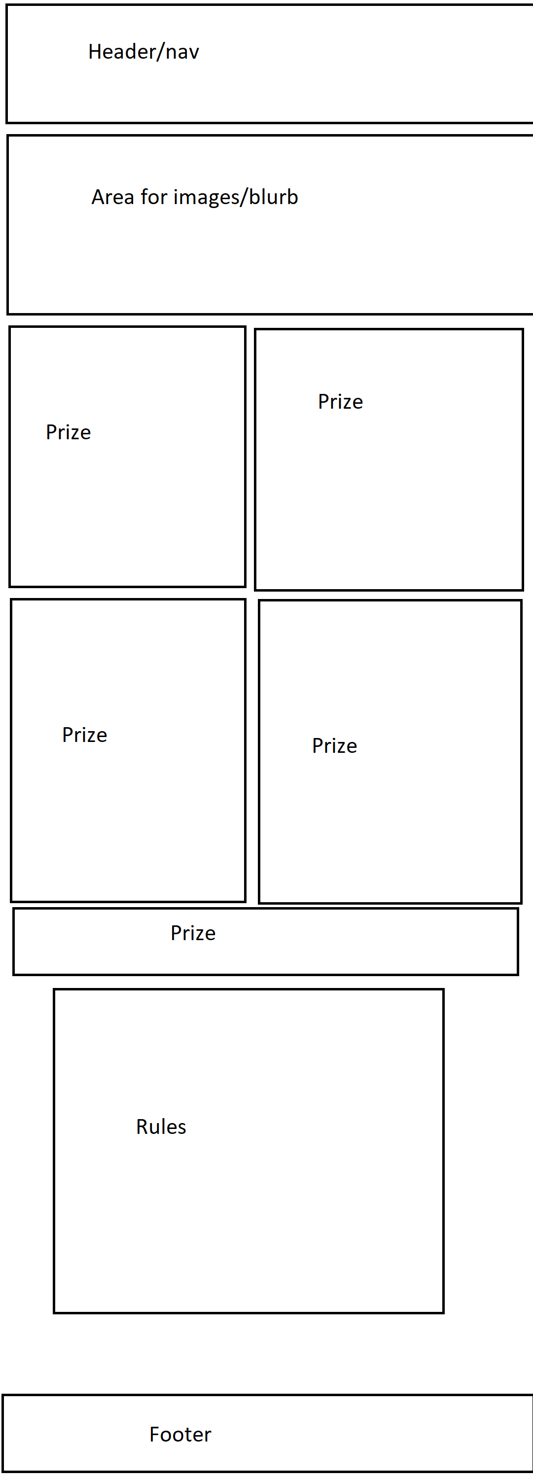
For the home page I had a pretty good idea what I wanted it to look like from the start and it was all about trying to get it to look like it did in my head. I love drop shadows on web pages for the 3d effect they give so I used them on the prize boxes to make them pop. In hindsight I would change the part directly below the header to have the image as a background and the text on top of it.
For the about page I picked out what images I wanted and put them in a flexbox so I could space them nicely. The rest of the page was a pretty straightforward linear page. If it was up to me the page wouldn't have an iframe and would instead have just a picture showing where the event would be but I didn't have time to implement that. I'm pretty proud of the rules section that is on both the home page as well as the about page, I think the alternating background color and the use of bold text worked out really well.